LearnHack #1: 7 tricks to make learning content less evil

Taking part in an e-learning course requires an investment of time and effort. As designers of learning experiences, we should be respectful of those two rather scarce resources of modern workplace learners.
There’s a growing consensus on the use of microlearning to better deal with cognitive overloads, busy schedules and short attention spans; but at the end of the day, it’s the learners who need to wrestle through the course.
Great learning content is always straight to the point with the most important pieces emphasised in a way that is easy to understand and worth remembering. A quick scan of such content should be a walk in the park. Dealing with poor learning content, on the other hand, may feel more like a dreadful attempt to escape the dark dungeons of Moria.
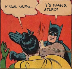
 At JollyDeck, we eat our own dog food. That’s why we value great learning content and highly encourage the use of visual mnemonics (don’t worry—that’s just a posh word for images). These are known to significantly improve learning efficiency. Here are some tips on how to craft the appropriate visual clues to make your content less evil:
1. Impersonation of the user
This one is probably the easiest and most straightforward. Try to guess what’s going through their heads while dealing with your content and match that feeling with the appropriate ‘visual mnemonics’.

Important: Space these images strategically throughout the course to sustain their attention.
2. Humour
People pay more attention to a humorous content than to a factual or serious one. Making jokes is not the easiest thing to do, but you can always refer to your friends and colleagues for inspiration. Every company has its internal jokes about a lot of things, and this is a perfect chance to use them to your advantage.
Important: A good joke is always worth remembering.

Explaining bias as part of equality and diversity training can be tedious. A short comic can quickly make the reader think about it from a practical perspective.
3. Exaggeration
Can’t come up with any humorous idea? Try exaggeration. Exaggerate your concepts or ideas beyond reason. We’re talking about outrageous Godzilla-sized exaggeration. To maximise the effect, use an image to exaggerate and combine it with an understatement copy (or vice versa).
Important: Have no fear once you decide to do it: anything less than Godzilla level will look pathetic.

We needed to emphasise the ubiquitous presence of mobile devices in our world and how they affect our lives, but most people are already aware of that, to some extent. What else could better spread their imagination than an image of a potty with an integrated iPad?
4. Surprise
This approach is really useful if you expect users to quickly scan through the content while you want them to stop, breathe and think about it for a while. Placing an unusual element in line with others can do miracles (or at least slow them down and give them some additional moments to think).
Tip: Surprise, much like exaggeration, should become a part of your authoring strategy. A twist in the plot is as important as the subject itself. It has inherent virality and can be the ‘glue’, another answer to ‘Why bother with this content at all?’

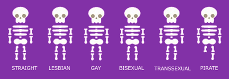
Promoting equality by using skeletons is nothing new. How about adding a different skeleton?
5. Symbols and metaphors
Do you need to present abstract ideas? Use a symbol or a metaphor to inject life to your content and make your user nod.
Tip: Try not to repeat what you have heard or seen before. Make sure that the metaphor is fresh.
There are a number of metaphors for skills gaps available on the Internet. Which one would you choose?

6. Emotions
If you completely run out of ideas, you can always get emotional and use an image of a kitten or another animal as long it’s little. Grown-ups are okay too if they are doing cute things.

Small animals work great…

…but large can work just as well.
7. Testimonials
Testimonials have a persuasive energy if they are from a trustworthy person (for this reason, you may not want to use the quotes of your CEO). They may just as well be anonymous. Remember, you’re using testimonials to prove the point of your content and make it easier to remember.
Important: Curate your leaders; they can have a nasty habit of going on and on and on about stuff. Remind them of the time constraints and have them deliver their message in a short and concise format (or find someone else who can do that).

Testimonials should always be provided by a credible and trustworthy source.
If all humans are biased, you need to find a nonhuman individual to present the fact.
These are just a few examples of how you can use images to amplify your content. The fact that you are still reading this proves that images work. Just imagine this post without images. Pure evil!
Before you close this out and run to your stock photo library, please take this one last important tip: don’t use stock images (at least not in a way that they’re intended to be used). Avoid clichés. Be creative; be foolish. Your users will appreciate it!
More #LearnHack posts:

